Crowd Connected: Colocator
A new platform from the ground up
A new platform from the ground up
A new platform from the ground up
A new platform from the ground up
What I did
User Experience
User Interface
Branding
User Experience
User Interface
Branding
Illustration
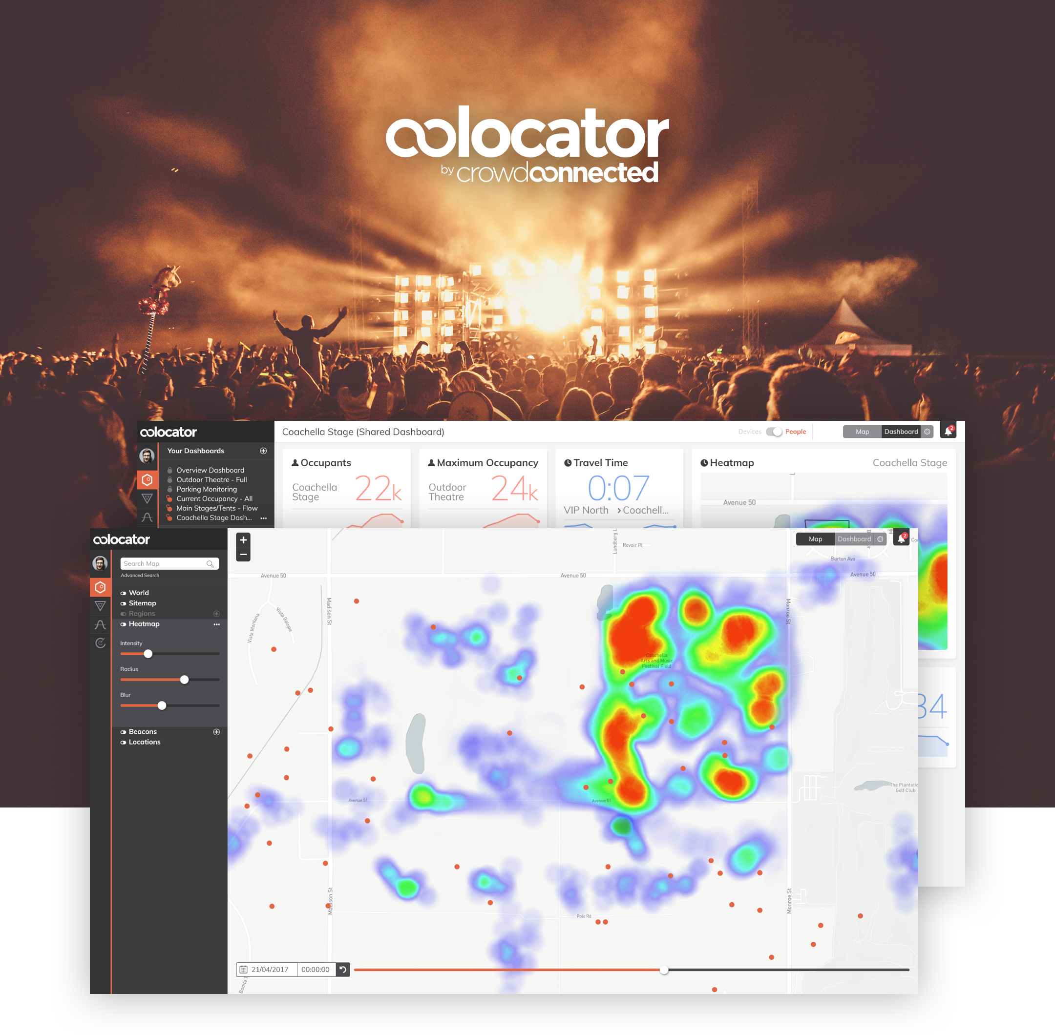
Crowd Connected is a ground-breaking UK technology business whose flagship platform, Colocator, turns event attendees into a connected sensor network. By embedding a lightweight software library into a mobile event app, organisers can immediately understand their customers movements and actions.
The problem
With a functioning MVP under their belts, Colocator 1.0 was no longer cutting it. With technology developments and new feature ideas in the pipeline, it was becoming very clear that the current platform was unable to meet its requirements going forward.
The solution
It was time for Colocator 2.0. The platform was redesigned from the ground up, dividing it into four freshly branded modules and meeting. This met a key business requirement to enable Crowd Connected to have different subscription tiers. Creating a fluid and intuitive user experience across all of the modules was of high importance, as well as creating a framework that could accommodate new features further down the line.
As used by:

Navigation
The sidebar navigation was created to be as minimal as possible. Accross all modules, Maps is the most common function so a part of the design was to create a sidebar that left as much open screen space as possible. The primary sidebar - used to switch between modules and access account settings (infrequent tasks) - is collapsed by default with a set of rules which make its use natural and unobtrusive. The secondary sidebar - with its layer configuration and visibility controls - is used much more frequently whilst in a module and as such it can be opened and collapsed on click.
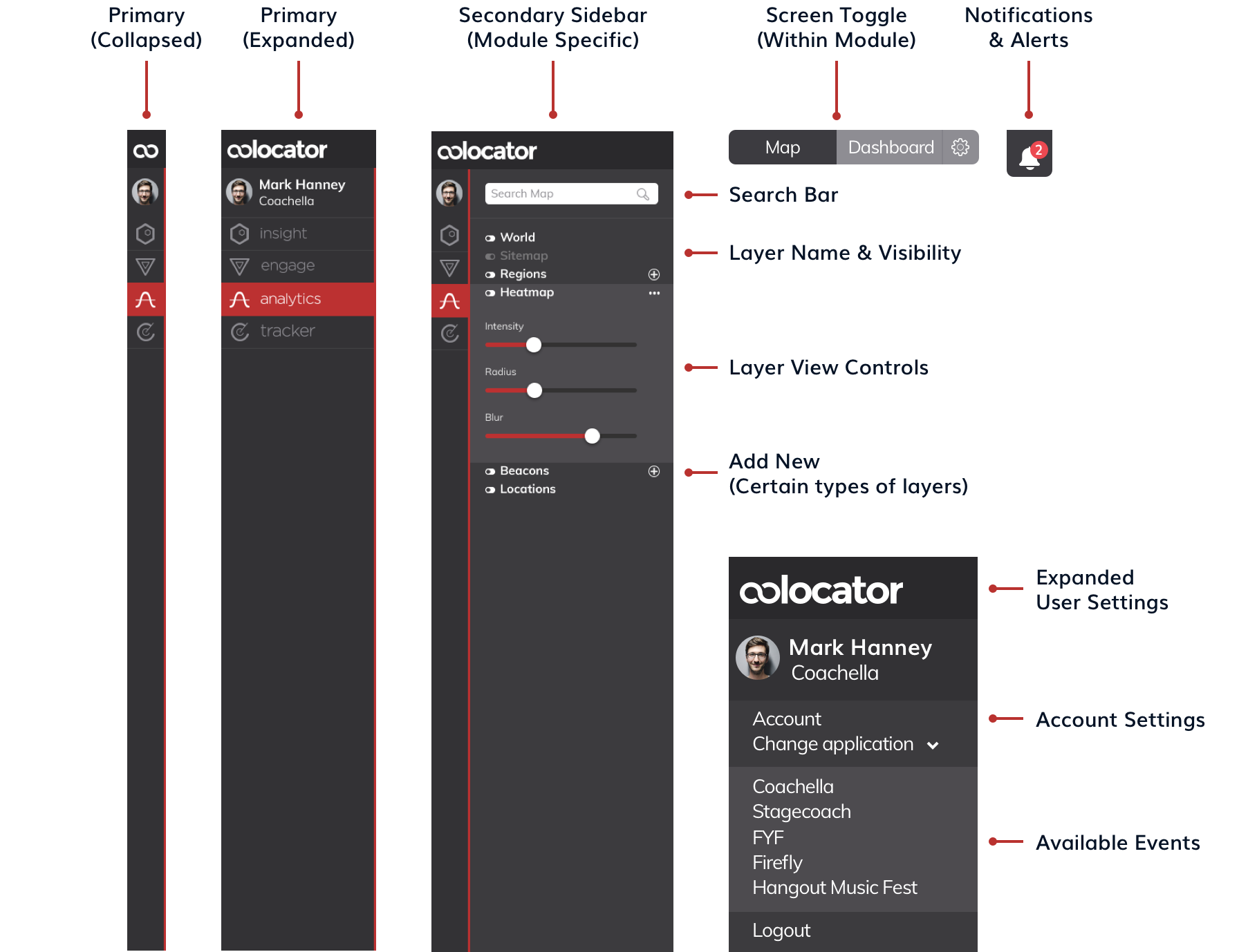
Map Screen Layout
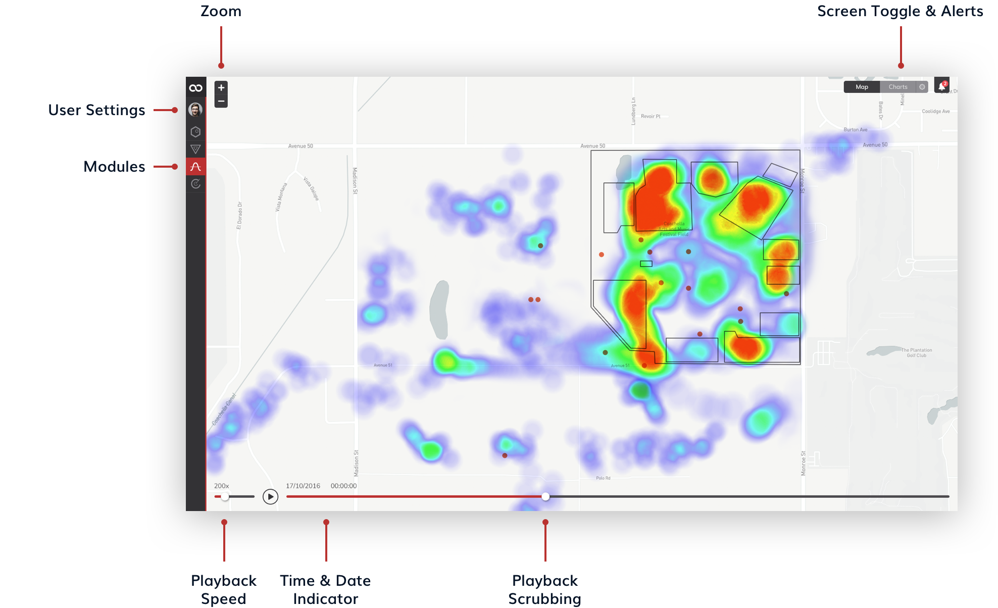
The combination of a minimal sidebar and the exclusion of a topbar maximises the available screen space with just the necessary controls ready for immediate use. Each module is branded with its own colour which is carried through to the controls.
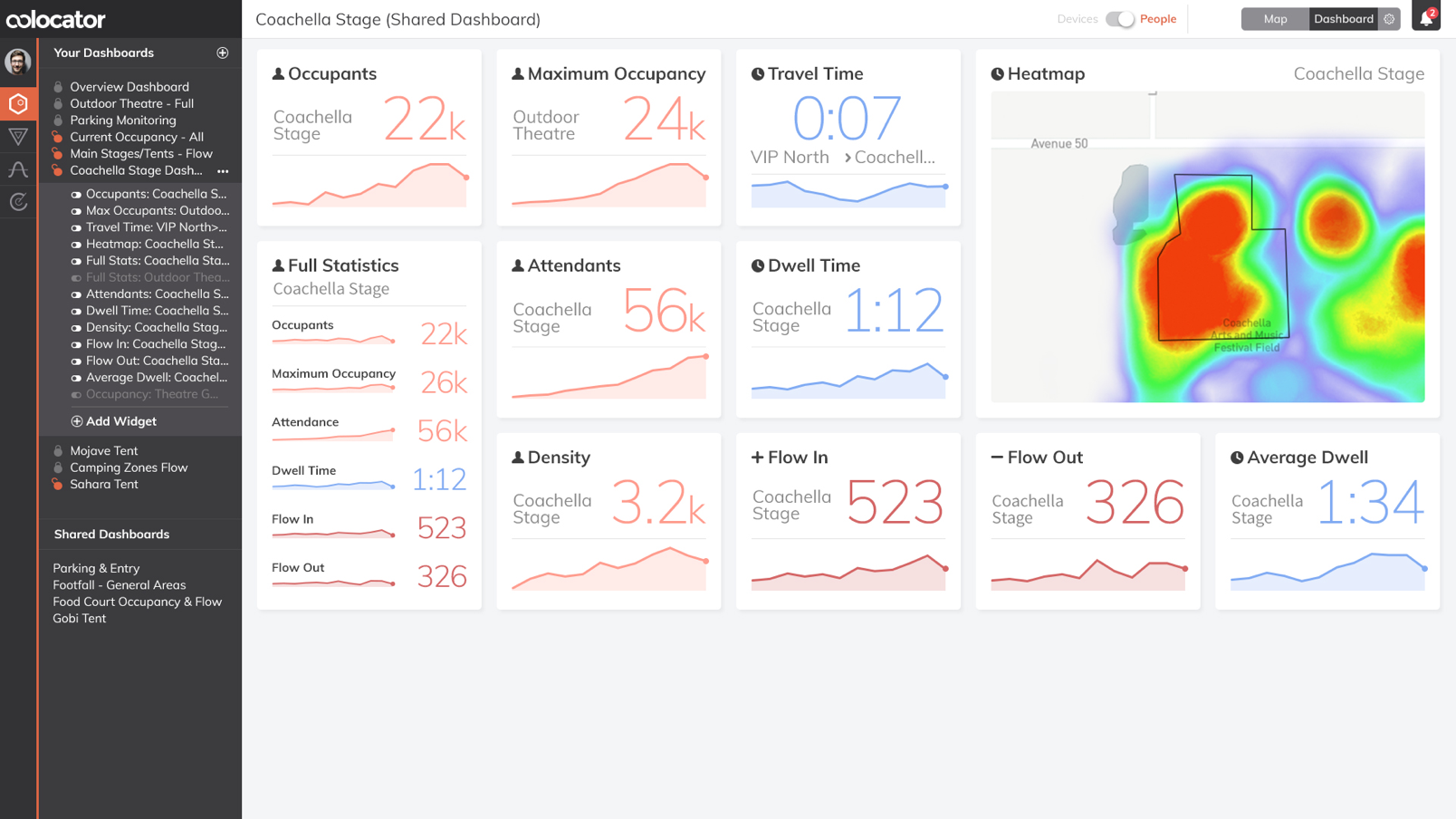
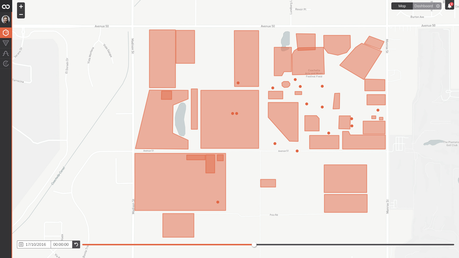
With maps and customisable dashboards, Insight provides a real-time picture of how the crowd is interacting with the event environment. This provides a toolset that enables event operations teams to be pro-active, not just reactive.
Key features of the Insight module include real-time heat maps with replay functionality, creation of unlimited regions both on site and offsite (on the fly, not just in advance) and customisable dashboards for Key Performance Indicators (occupants, footfall, dwell by region, travel time etc).
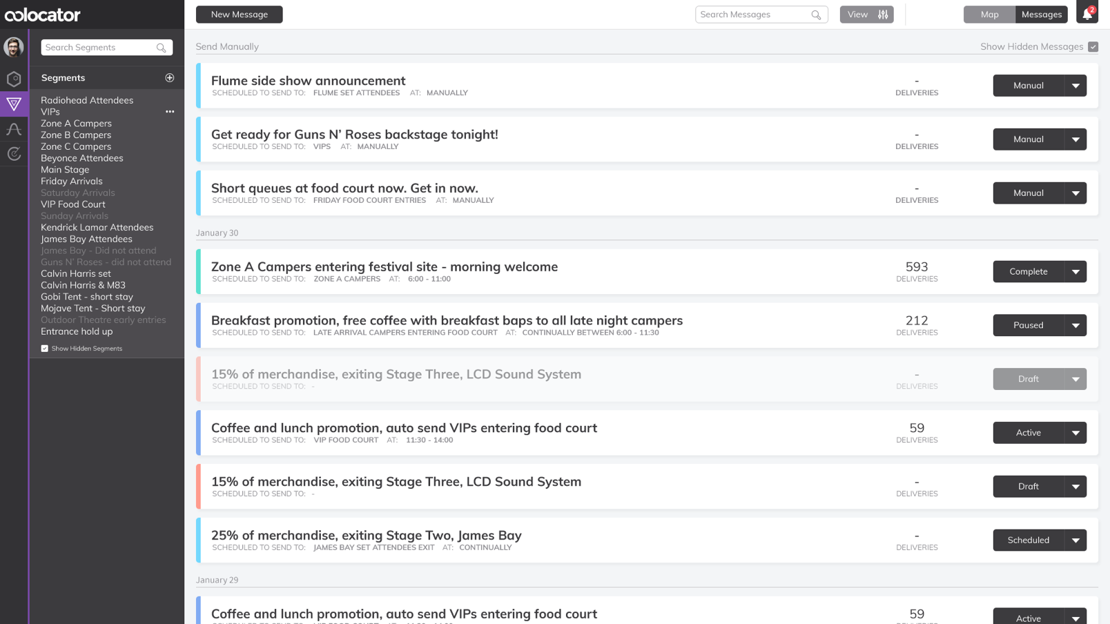
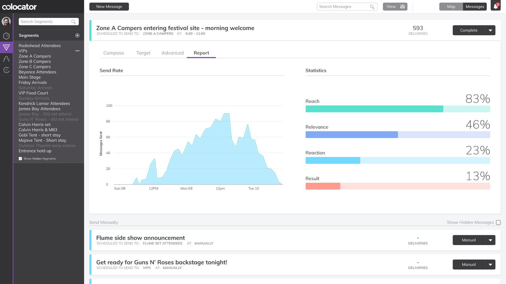
Made for marketers, the Engage module is marketers dream! It’s an audience engagement and segmentation engine that delivers geo-targeted and trigger based messaging to enhance customer experience.
With unlimited combinations of location/time, Engage integrates with leading in-app messaging platforms to deliver high impact messages based not just on where indivudals currently are, but where they’ve been and where they’re heading.
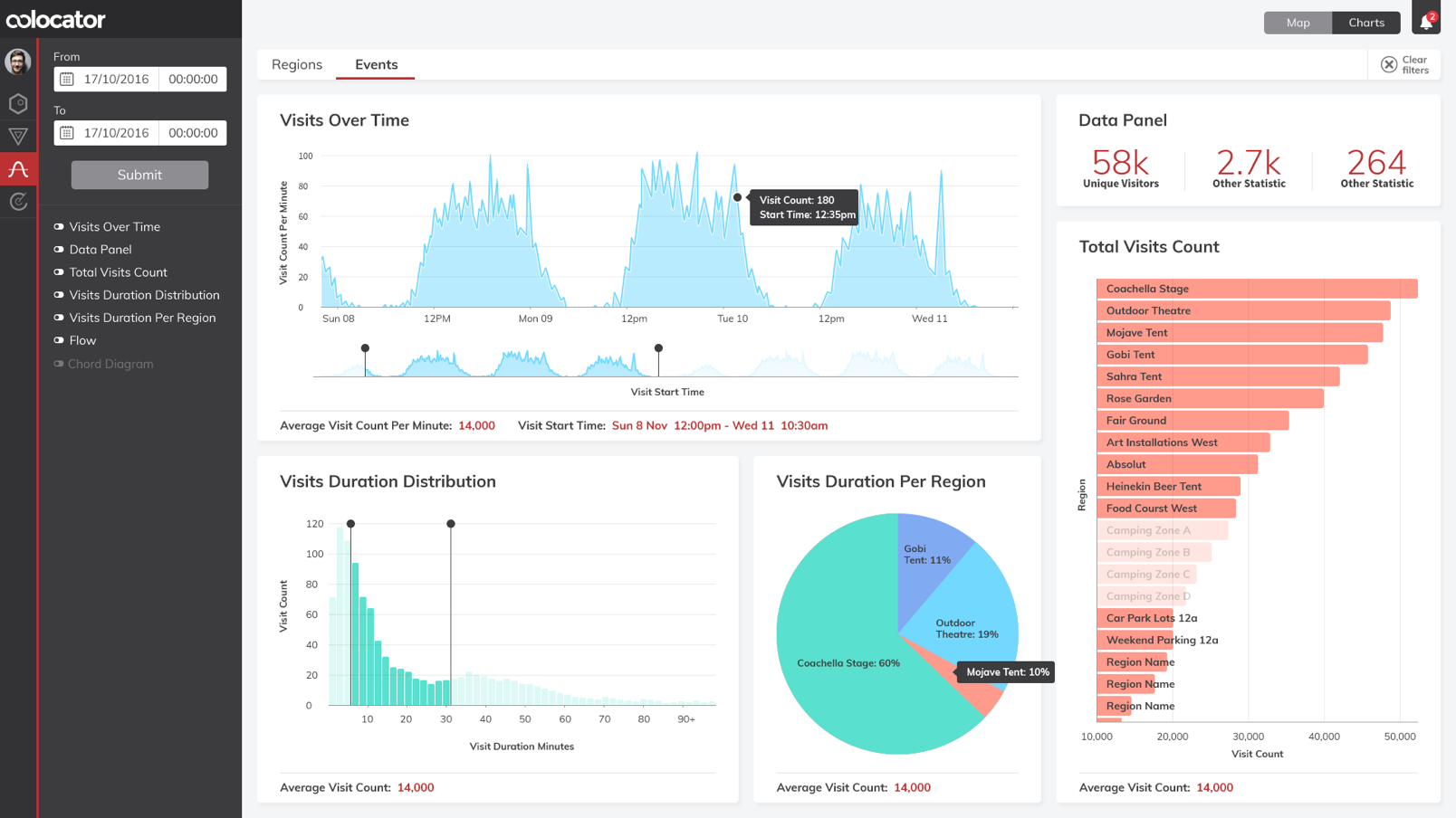
The Analytics module enables organisers to review their event and the crowds interaction with the venue in great depth. The first part is the Heatmap, with variable time ranges, playback speed and visibility controls for the entire event.
The second part is a set of interactive charts that enable organisers to drill down and review attendees behaviour for any combination of time and area: what they were doing, where they went and how long they spent there.
The Analytics module is invaluable when it comes to planning, managing and optimising future events.
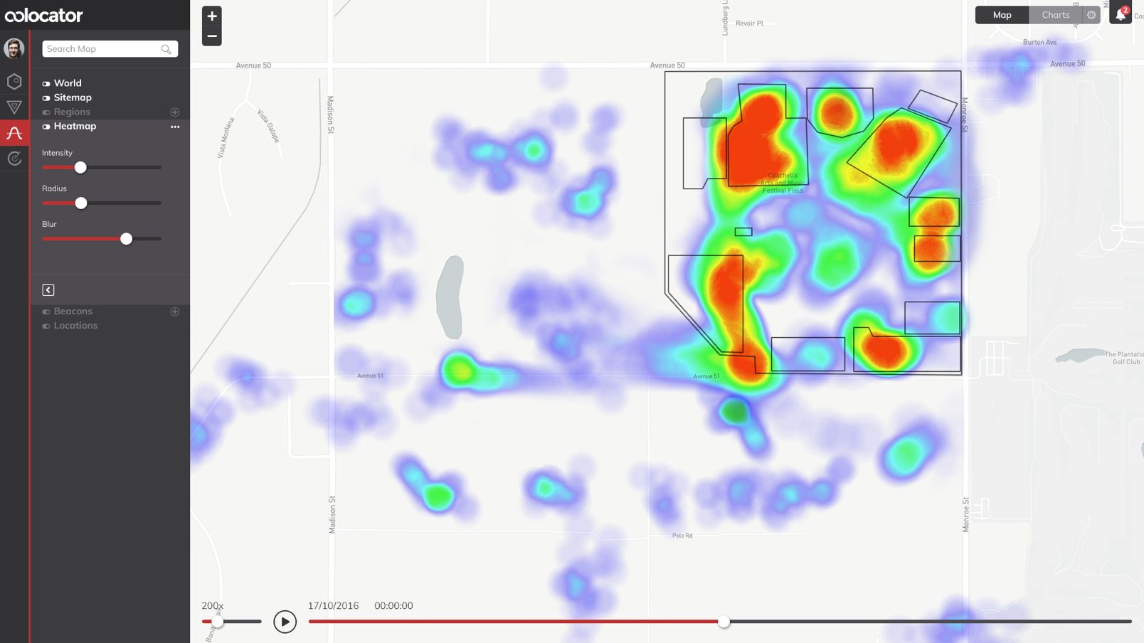
Using physical tags, Tracker enables event organisers to assign tags to people, vehicles and assets for real-time location monitoring. Tags can be easily searched and managed through the visibility controls, colour coding, search bar & grouping.
Trajectory histories are saved for immediate or post-event playback.
More Projects
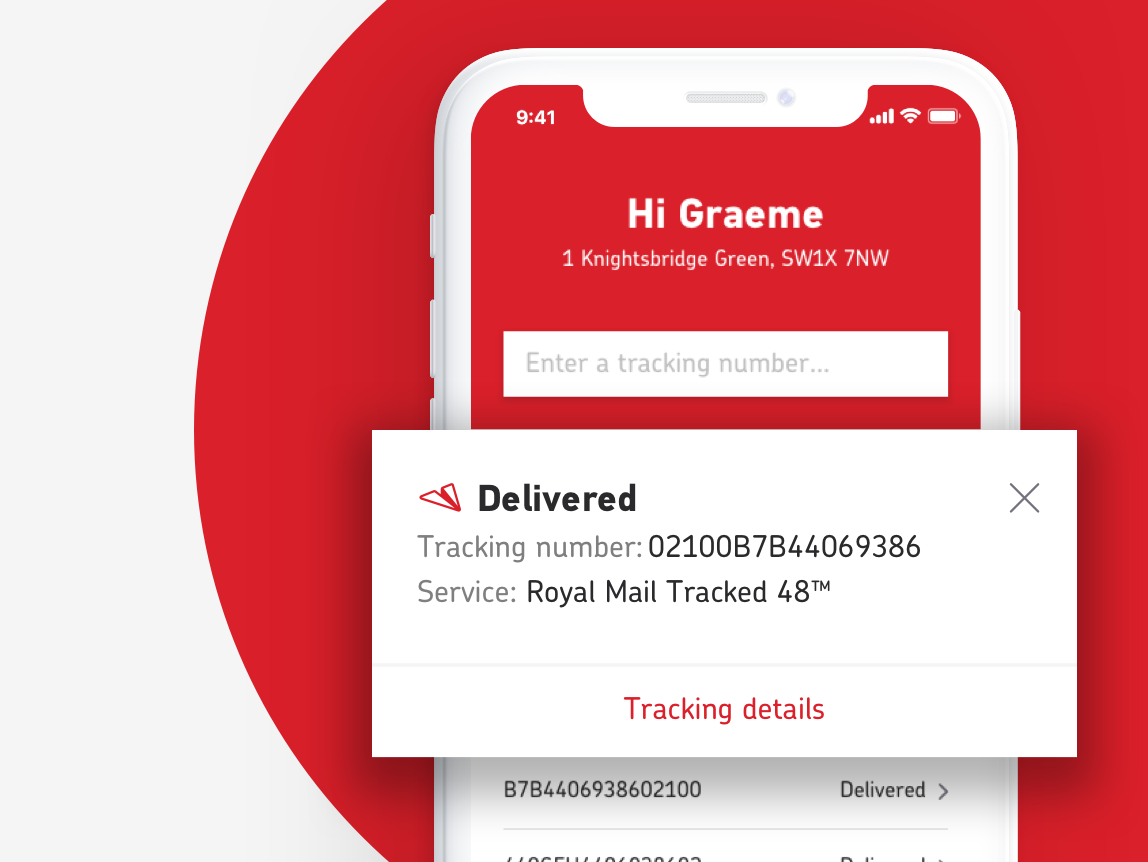
Royal Mail AppNative App
Legal & GeneralProject type
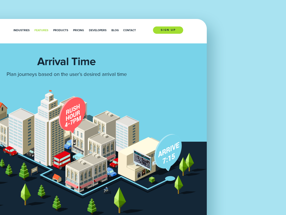
iGeolise: TravelTimeMaking sense of travel time
Travel GuardianPutting passengers on the right track
SybenetixUI Design
Copyright © 2018 Mark Hanney
Copyright © 2018 Mark Hanney
Copyright © 2018 Mark Hanney
Copyright © 2018 Mark Hanney