iGeolise: TravelTime
Making sense of travel time
Making sense of travel time
Making sense of travel time
Making sense of travel time
What I did
User Experience
User Interface
Branding
Illustration
User Experience
User Interface
Branding
Illustration
Agency
Agency
iGeolise provide software to consumer-facing websites and location based decision makers. No one ever makes the excuse that they’re “running 2 miles late”. Their aim is to make locations relevant by using time.
The problem
With a growing product line and feature list, the brand was becoming confusing. What was a product? What was the company. What was a feature?
The solution
They needed a full rebrand of the company and products and a website for their flagship product, TravelTime platform.


The passion and enthusiasm the team at iGeolise have for their technology and its capabilities is immediately infectious. It’s this as much as the technology itself that draws you in, so it was extremely important that the brand and the website gave that same impression to potential customers.
So we focussed on a modular framework that would break information down into manageable chunks of information along with engaging illustrations and examples of how the technology would benefit the various sectors.
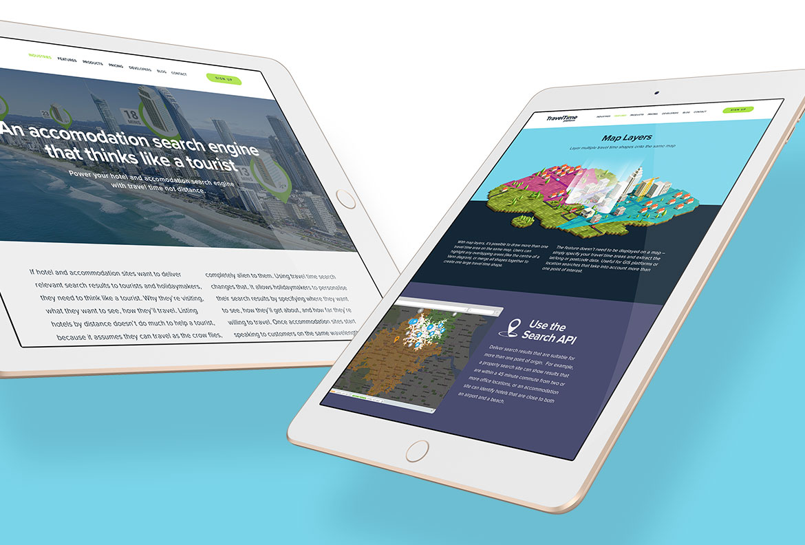
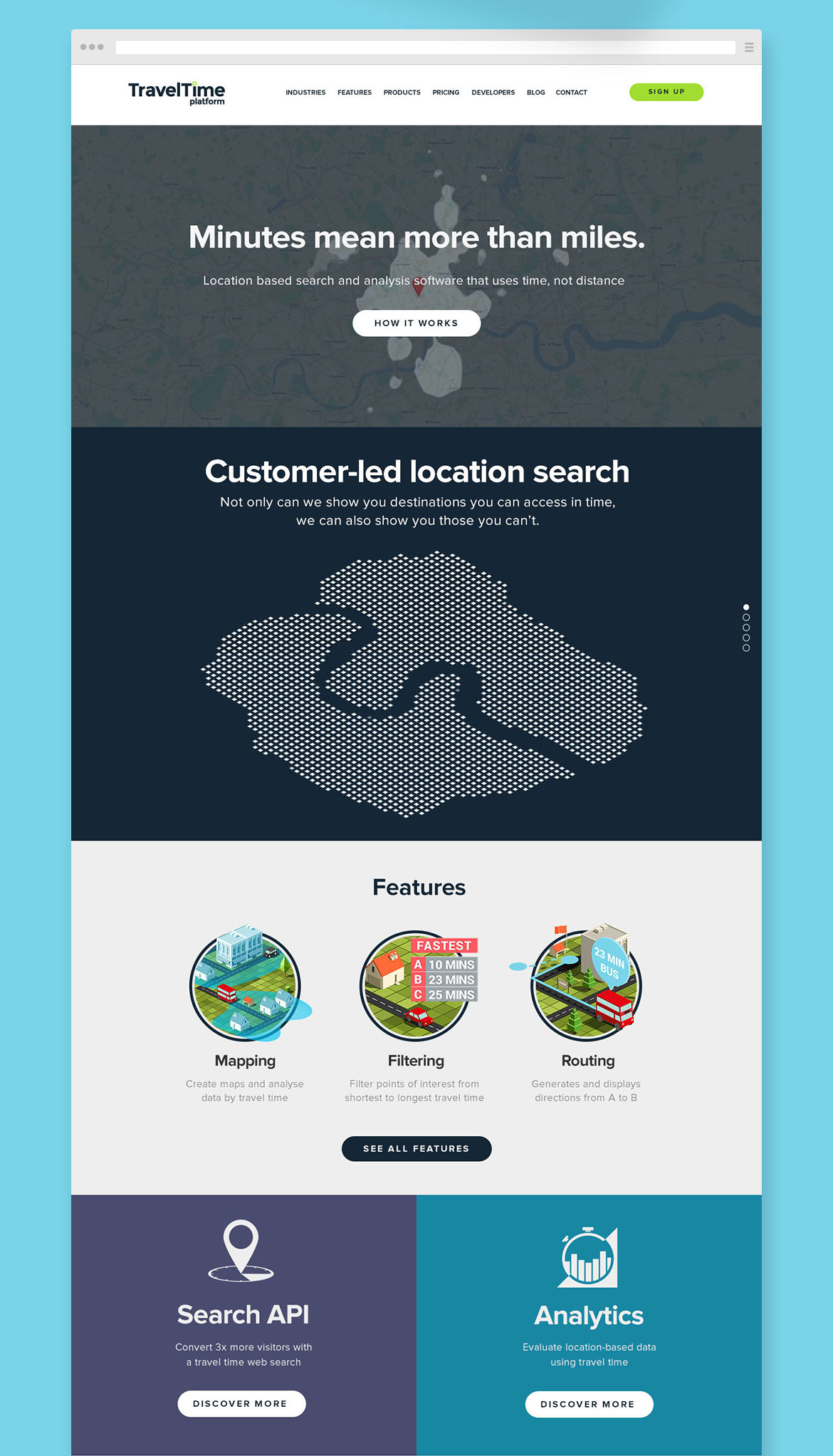
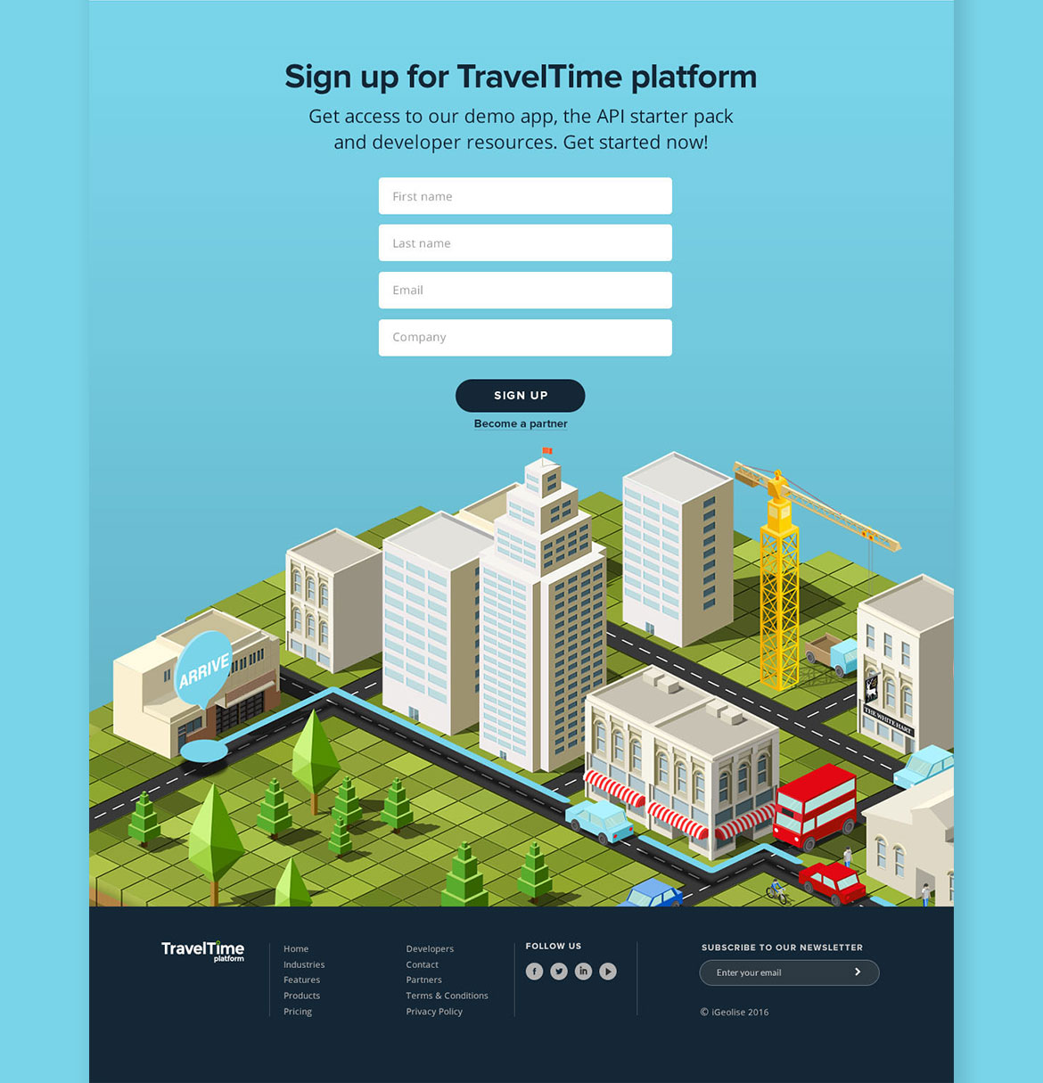
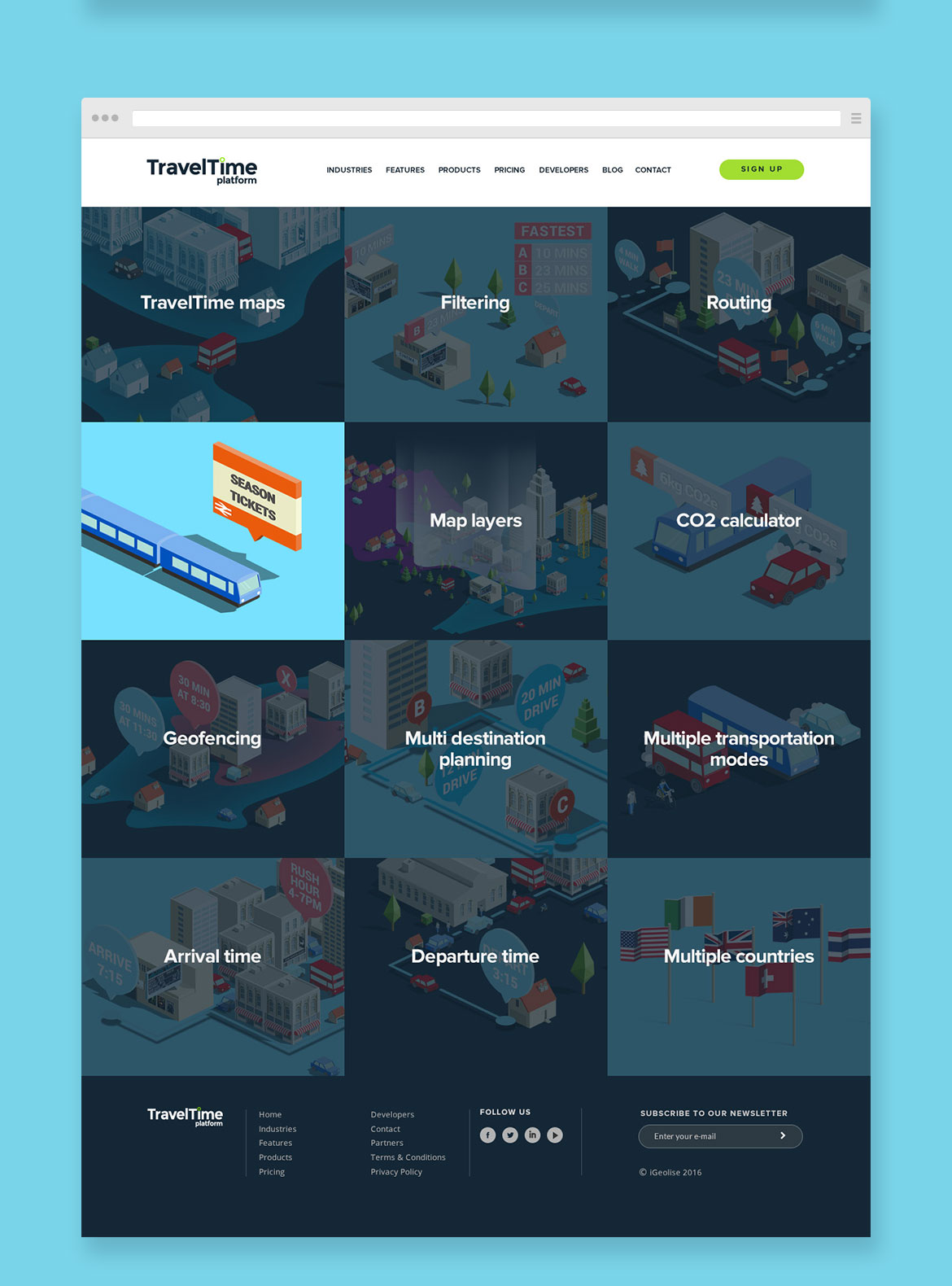
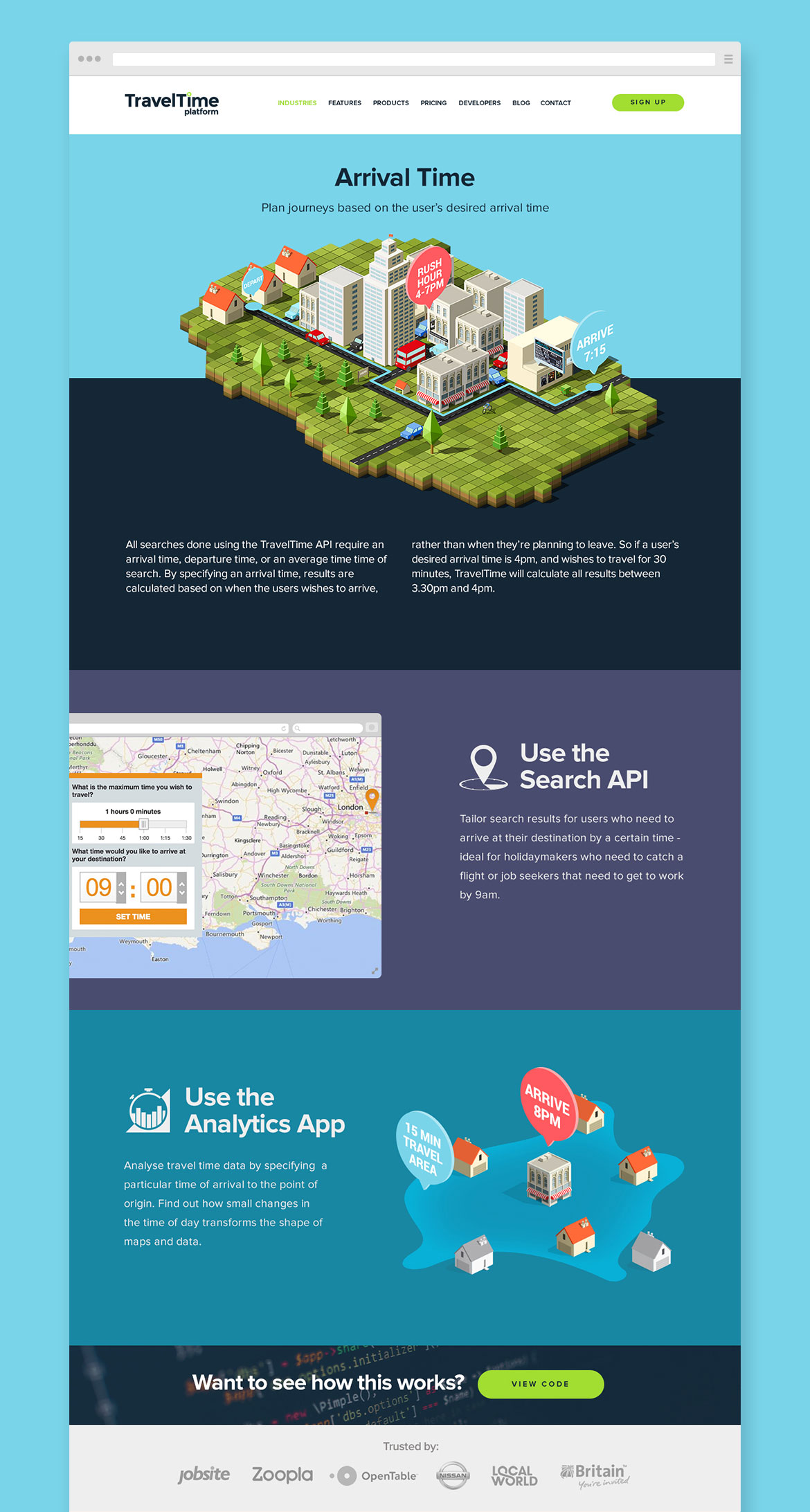

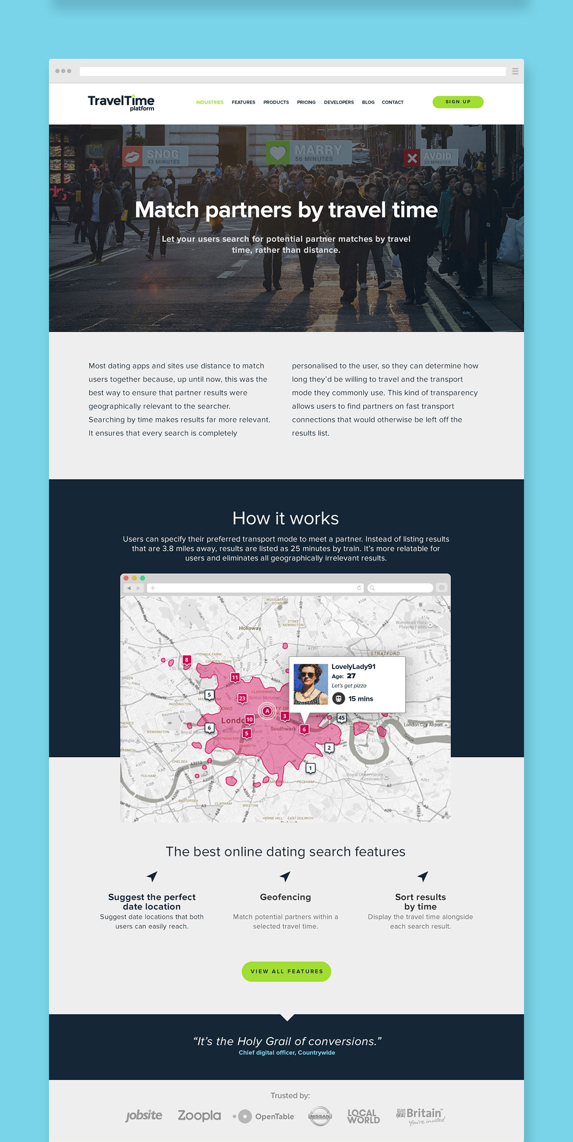


Illustration & supporting materials
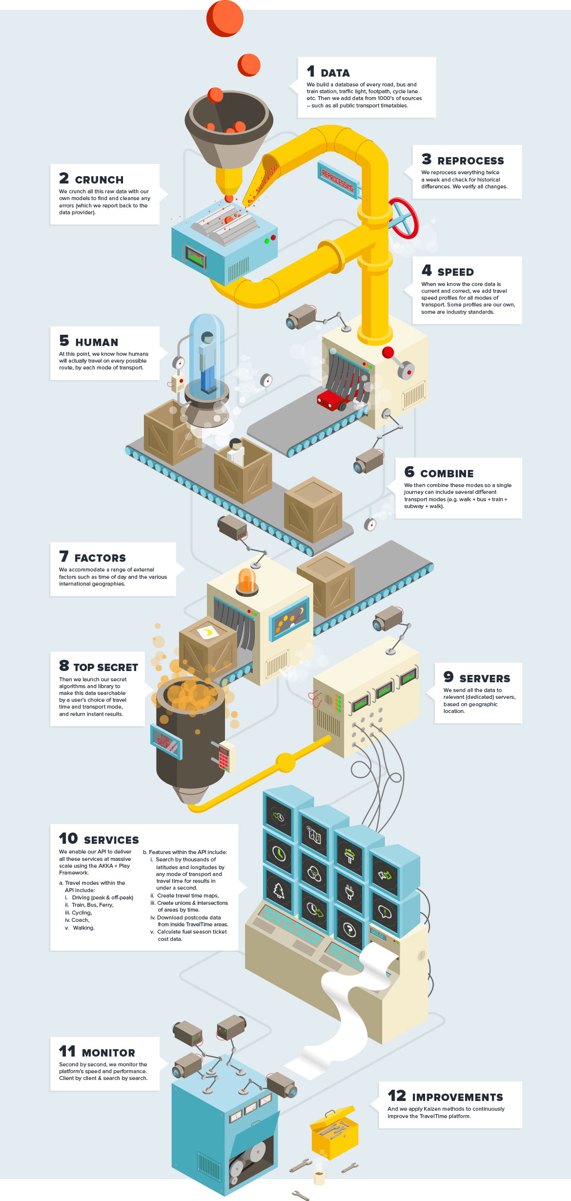
As well as the branding and website, an ongoing relationship involved supporting material for documents, email communications, keynotes, videos, icon design and custom illustration. The piece below was part of communication piece explaining how the TravelTime technology works.
More Projects
Royal Mail AppNative App
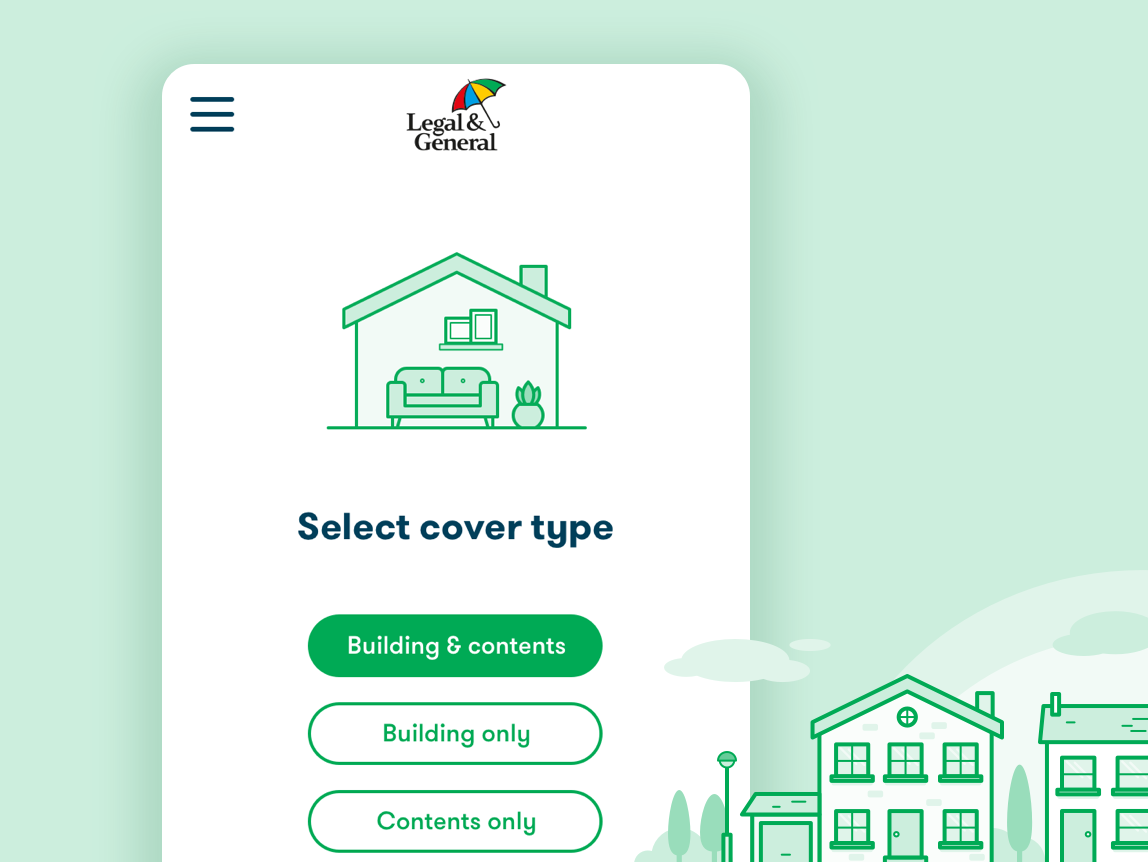
Legal & GeneralProject type
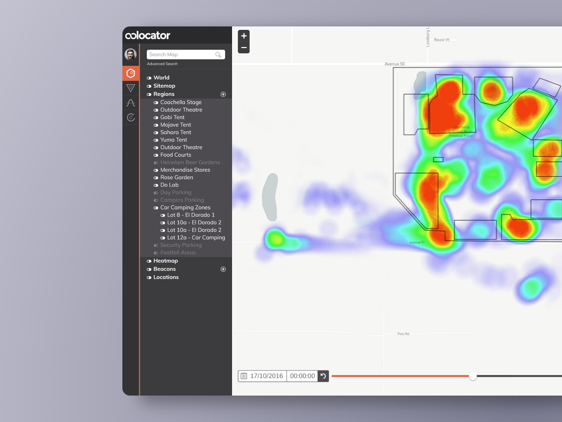
Crowd Connected: ColocatorProject type
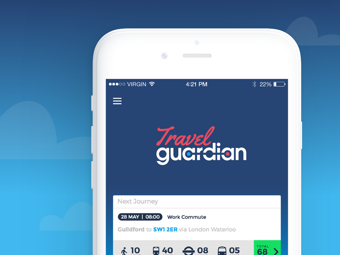
Travel GuardianPutting passengers on the right track
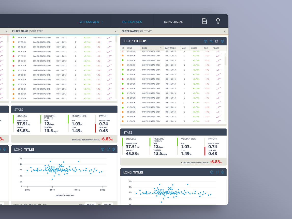
SybenetixUI Design
Copyright © 2018 Mark Hanney
Copyright © 2018 Mark Hanney
Copyright © 2018 Mark Hanney
Copyright © 2018 Mark Hanney