Legal & General
An insurance quote to feel good about
An insurance quote to feel good about
An insurance quote to feel good about
An insurance quote to feel good about
What I did
User Experience
User Interface
UI Animation
Illustration
User Experience
User Interface
UI Animation
Illustration
Agency
Agency
In a landscape where everything’s the same, standing out from the crowd has become a marketing exercise. The insurance quote journey is an area of financial services that is consistently the same - no one breaks the mould in terms of product and/or service.
The problem
Making a decision on your insurance is a box ticking exercise. Unfortunately, when the customer comes to finding the right product, that sameness is all too aparent. The process of buying becomes a very fomulaic, nondescript experience. Legal & General’s “smart”, shortened quote journey was resulting in a lack of trust and confidence from customers and was showing in their low completion rates. Legal & General needed an improved quote journey to engage with customers, instill confidence and increase their conversion rates.
The solution
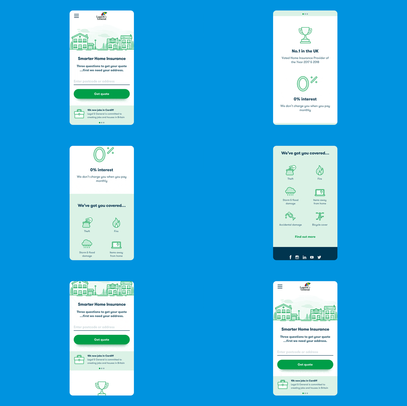
To differentiate Legal & General from the competition, their quote journey needed to go beyond the functional. It needed to create an experience that connects emotionally with the customer and ultimately leaves them thinking “this just feels right”.
Many different elements were looked at to identify areas where L&G could elevate their experience into something memorable and unique. By creating an experience that has a high perceived value it would put less pressure on pricing, increase loyalty and shut out the competition.
Evaluating the competition
It was clear that many businesses fundamentally aren’t understanding their customers needs, or more specifically, they aren’t creating experiences that talk to their customers on all of the appropriate levels.

Experience Index
But what are those levels? Working closely with the Strategy team, an experience was created that would connect with the customer using the experience pillars of: Function - it just works; Emotion - it makes us feel; Purpose - it connects us to something bigger.



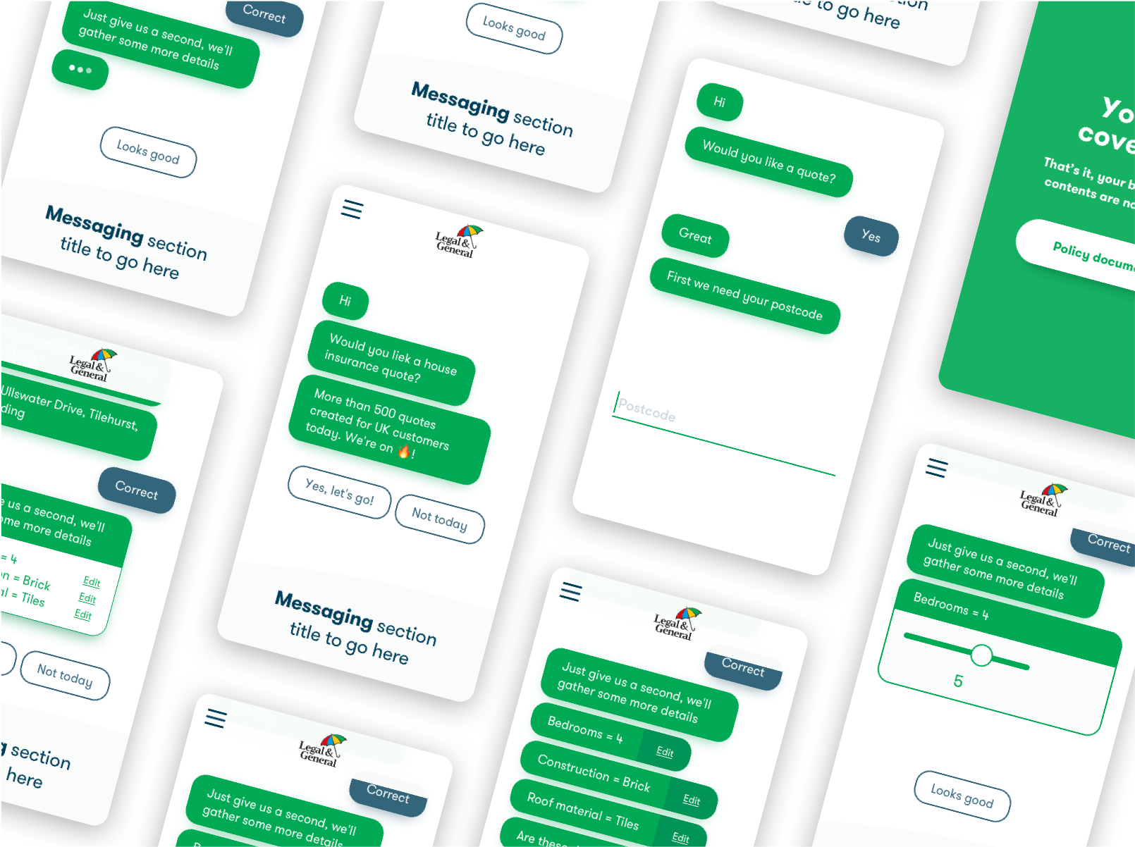
Exploring conversational UI
Exploration was done into conversational UI’s as the client had implied this could be a desirable solution. However, it actually felt like it was unnecessarily bloating a shortened journey and previous experience had shown it raises challenges when editing previous fields.
Adding to that, people tend to form a solution in their mind and then ask questions that validate what they believe to be true. In other words, their questions are solutions masquerading as questions.
Exploration was done into conversational UI’s as the client had implied this could be a desirable solution. However, it actually felt like it was unnecessarily bloating our shortened journey and previous experience has shown us it raises challenges for users when editing previous fields.
Adding to that, people tend to form a solution in their mind and then ask questions that validate what they believe to be true. In other words, their questions are solutions masquerading as questions.
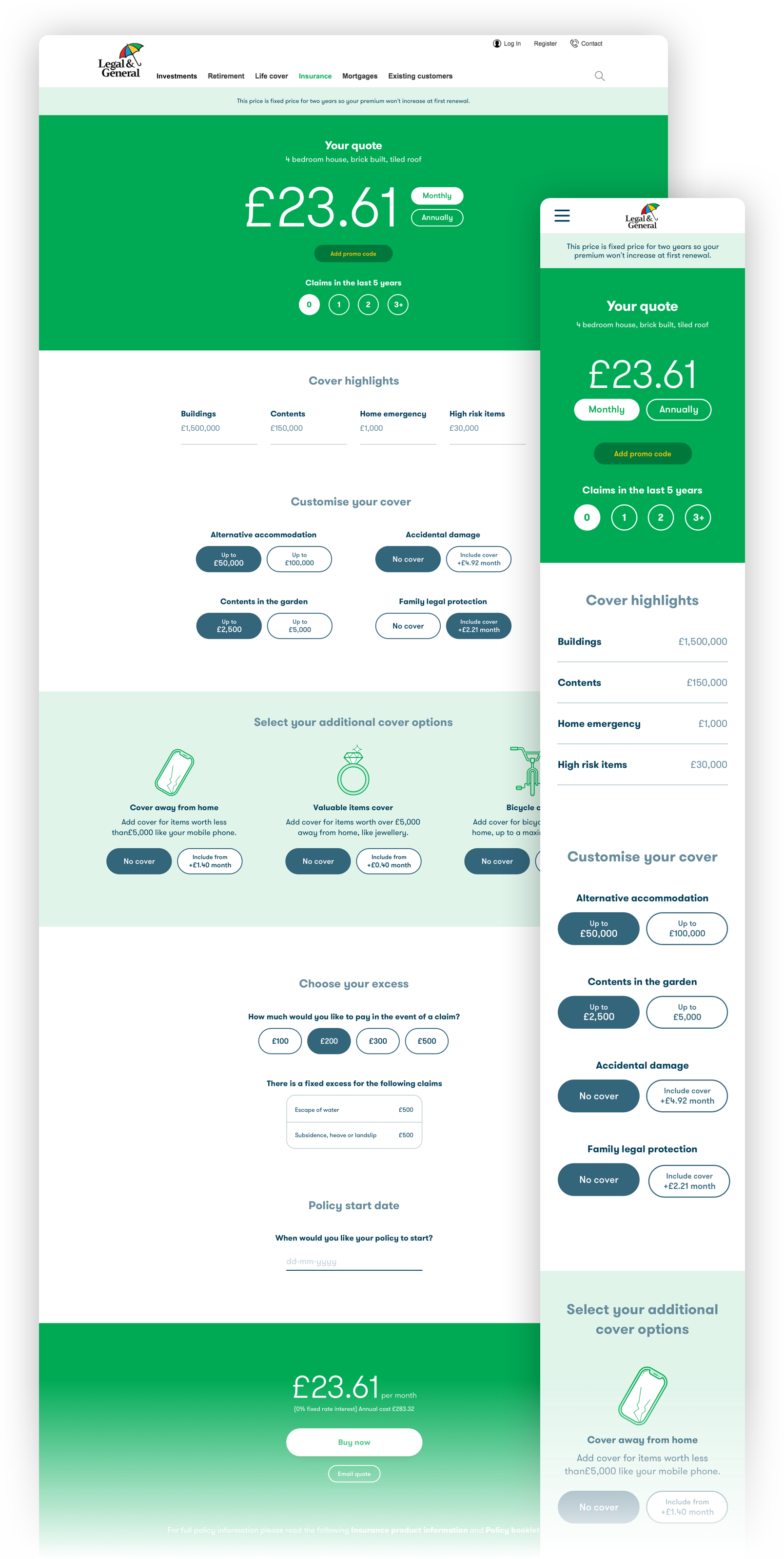
Delivering the fundamentals makes us viable but crafting something beautiful and unique makes us memorable.
Delivering the fundamentals makes us viable but crafting something beautiful and unique makes us memorable.
Delivering the fundamentals makes us viable but crafting something beautiful and unique makes us memorable.
More Projects
Royal Mail AppNative App
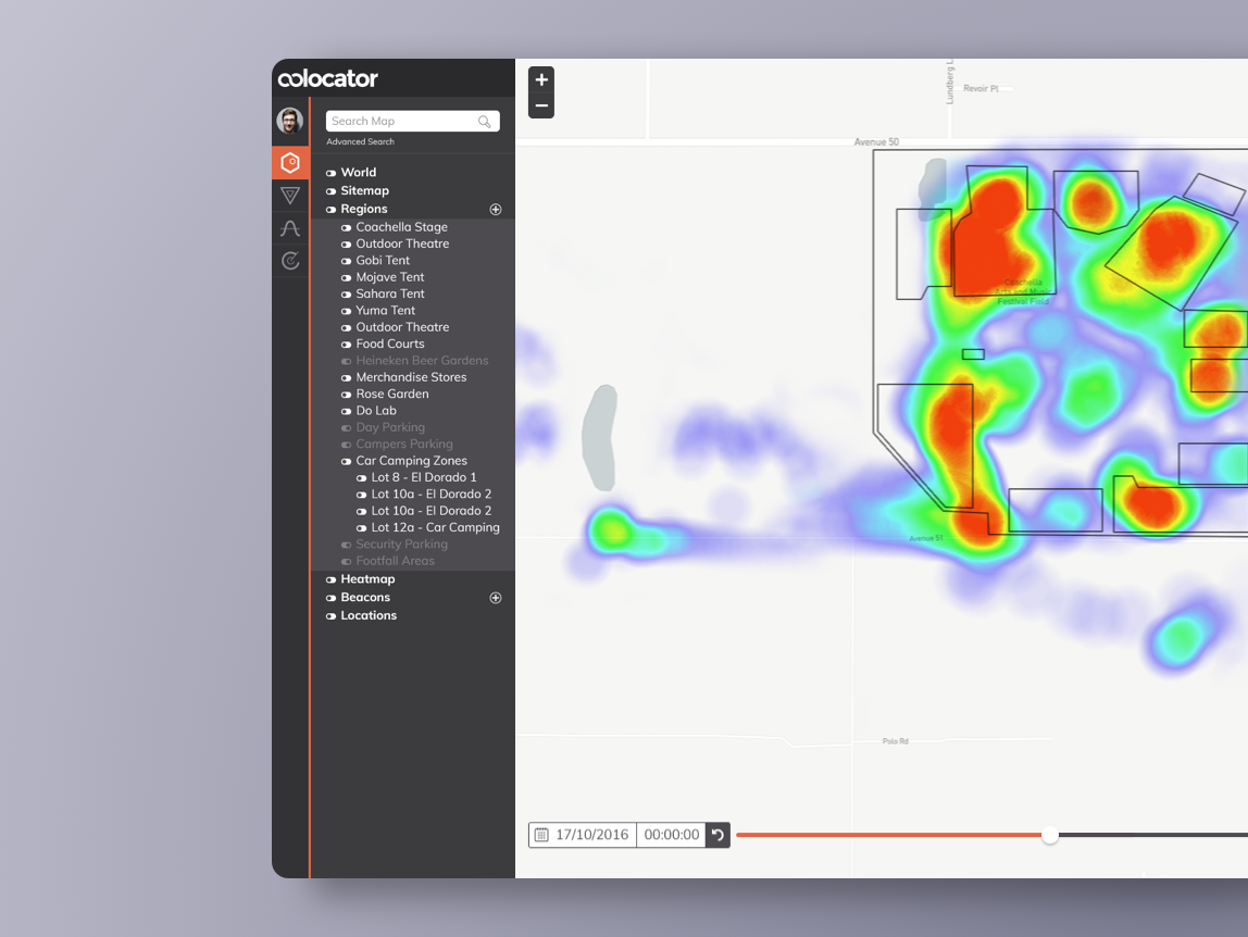
Crowd Connected: ColocatorProject type
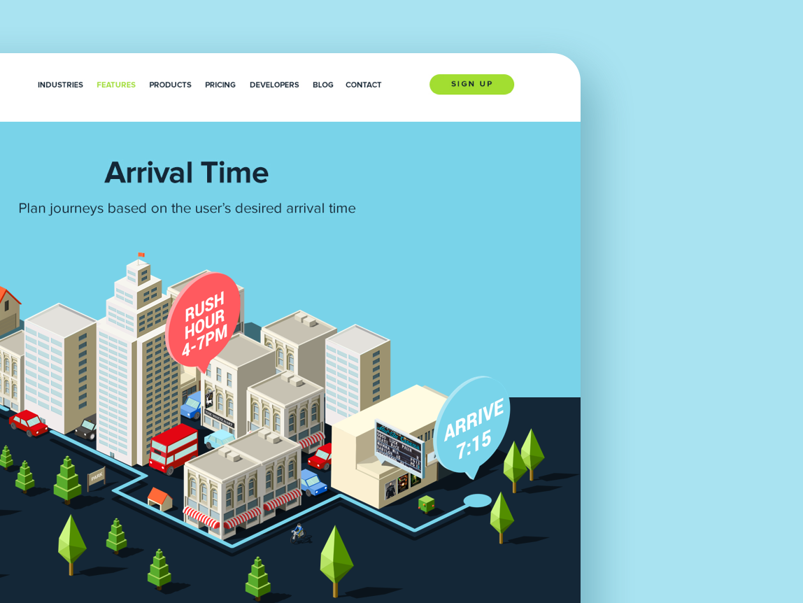
iGeolise: TravelTimeMaking sense of travel time
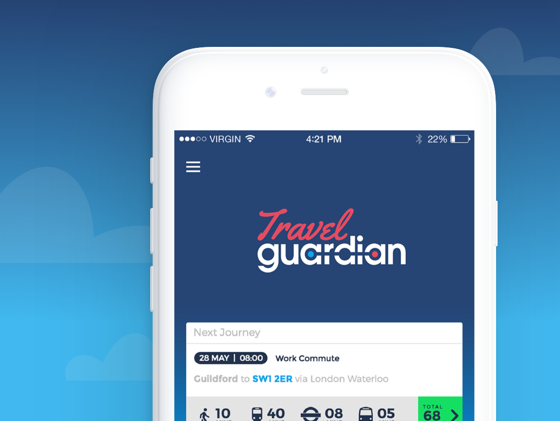
Travel GuardianPutting passengers on the right track
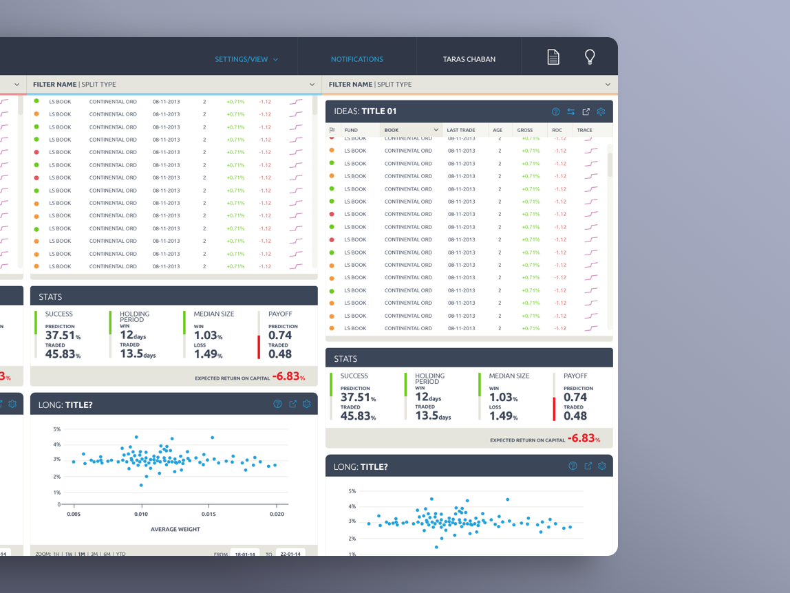
SybenetixUI Design
Copyright © 2018 Mark Hanney
Copyright © 2018 Mark Hanney
Copyright © 2018 Mark Hanney
Copyright © 2018 Mark Hanney