Royal Mail
Delivering an app for Royal Mail's future
Delivering an app for Royal Mail's future
Delivering an app for Royal Mail's future
Delivering an app for Royal Mail's future
What I did
User Experience
User Interface
UI Animation
User Experience
User Interface
UI Animation
Agency
Agency
As the market leader in the UK postal sector, Royal Mail is expected to lead the market in consumer experience. A number of key competitors had already released mobile apps to improve the customer journey and engage recipients in their channel of choice. Royal Mail was conspicuous by its absence in this market.
The problem
With a history of unsuccessful apps, Royal Mail were taking a cautious approach to this one. Initally an MVP was required to establish a presence in the market and build a platform for further releases of functionality. Based around delivering a handful of key journeys covering recipient experience (receiving letters and parcels), exisiting APIs needed to be used to deliver data to the app with no new backend development being undertaken. The challenge was how to make a fairly dull journey (eg. Branch finder) feel slick without incurring too much development overhead.
The solution
From the outset, two key things were established as being necessary for successfully delivering the app to market quickly and efficiently, whilst pathing the way for future design and development.
Firstly, with no concrete idea of all future functionality, it was essential that the app created a framework and navigation system that was flexible enough to accommodate MVP functionality as well as any future functionality.
Secondly, an intelligent approach to design was required for speed and efficiency of both design sprints and development. For this reason the app was designed using the principles of Atomic Design to improve reusability, efficiency and communication between teams.
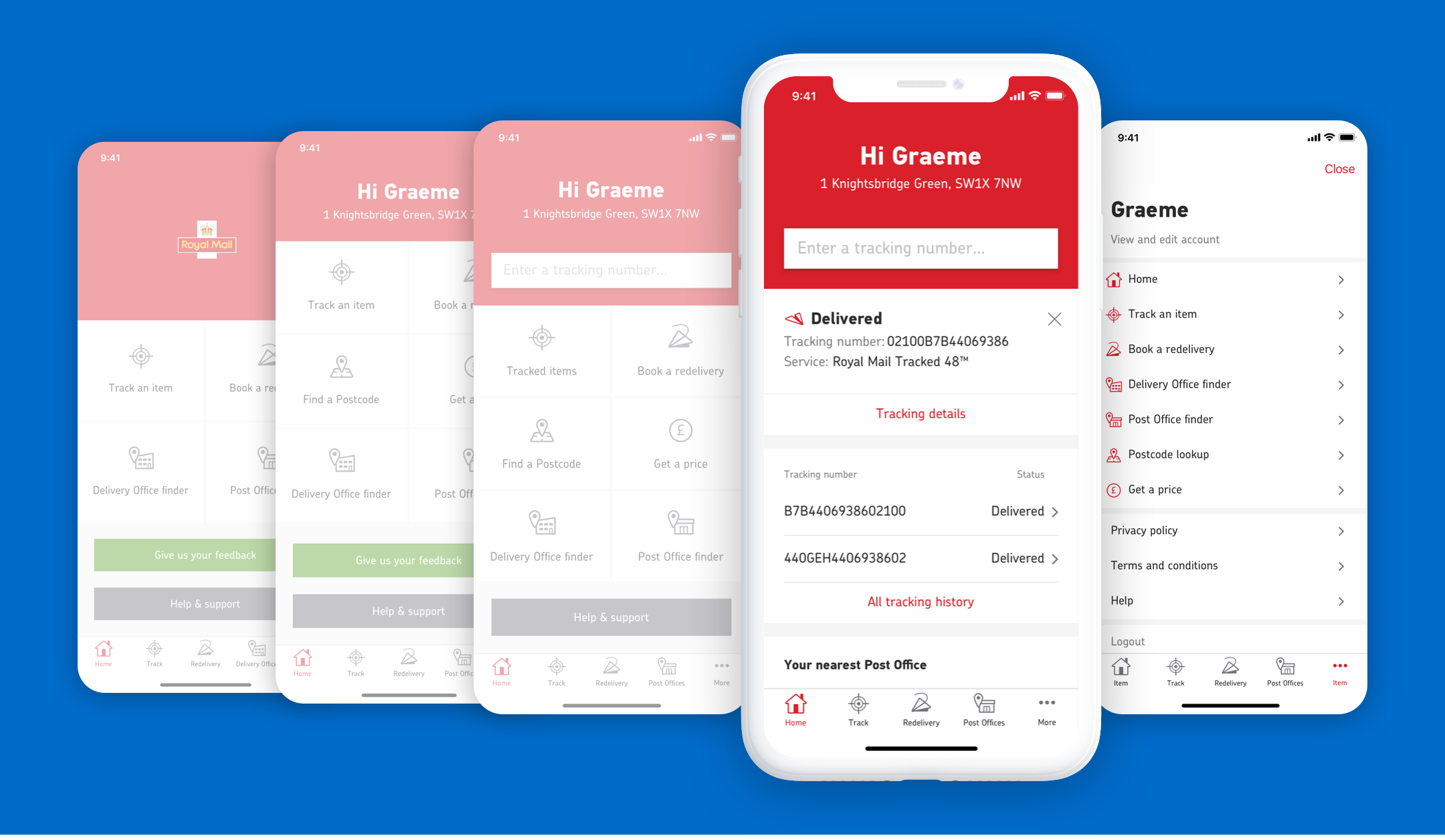
Evolution of the homepage
Homepage evolution
While each journey had an existing reference point in its corresponding online and mobile equivalent, there was no homepage design. There was an existing mobile homepage but the app needed to feel like an app and not like a version of the mobile site. For the MVP the homepage was used as a navigation hub, and being an MVP, access to “Give us feedback” and “Help & support” was given a stronger focus than normal.
The second evolution of the homepage saw the introduction of more navigation options, as well as the beginnings of app personalisation.
The third evolution is where deeper functionality has started to come to the homepage with the Tracking entry field making an appearance as analytics told us that the number one reason users were accessing the Royal Mail site was to track an item. This paves the way for the “final” homepage evolution which sees a proactive dashboard approach - thinking ahead, bringing deeper and more useful information to the forefront.
Menu exploration
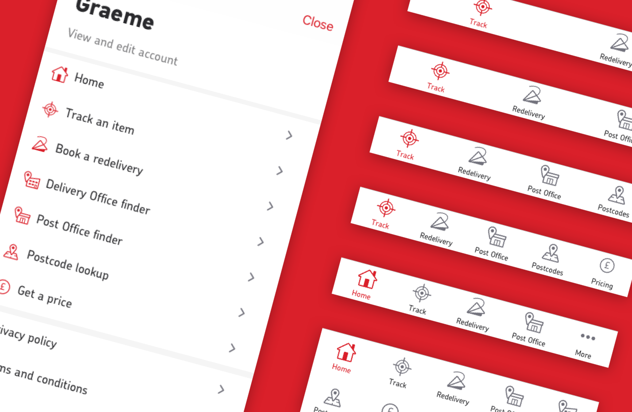
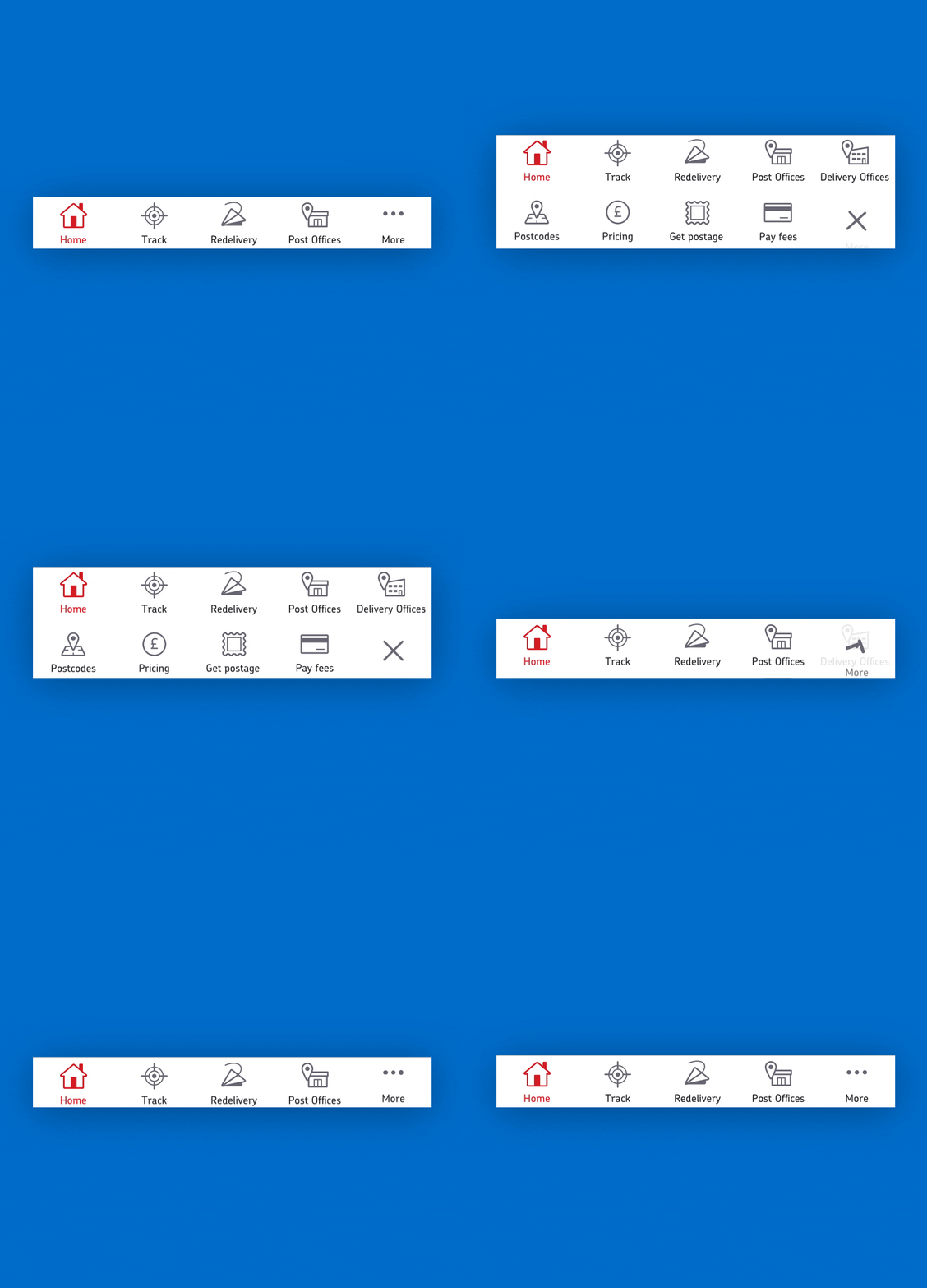
While the MVP homepage was itself all navigation, the final evolution of the app would replace the homepage’s pure navigational purpose altogether. For this reason a bottom tab menu was used from the start. This would also ensure that even at MVP stage, quick switching between journeys was possible without having to go back to the homepage.
As can be seen below, exploration was done into how the tab bar could accommodate items from 2, all the way up to 9+. However, ultimately the decision was made that the “More” menu item would see a full page menu come into play. As well as housing all menu items, it also gives a suitable place for personalisation options and access to web-view links such as Privacy Policy.
Iconography
While there were a few existing icons from the desktop site, a consistent set of icons for each journey was lacking and needed to be produced. The most instantly recognisable icons often couldn’t be used as the app, although Royal Mail, actually involves three separately owned businesses; Royal Mail, Post Office and Parcel Force. This meant an envelope, for example, couldn’t be used for a mail icon as this would favour Royal Mail letters over Parcel Force parcels.
The Royal Mail app, by nature is a very functional app, so the icons were an opportunity to help give it a bit more character. Consideration was given as to how these icons (and other UI components) could animate in future versions to add some subtle moments of delight and give a very functional app some added wow factor.

Locations
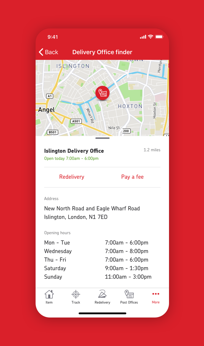
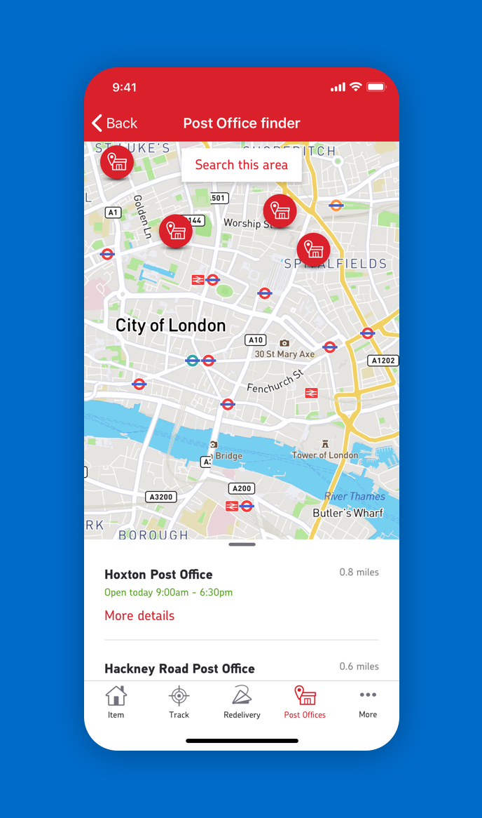
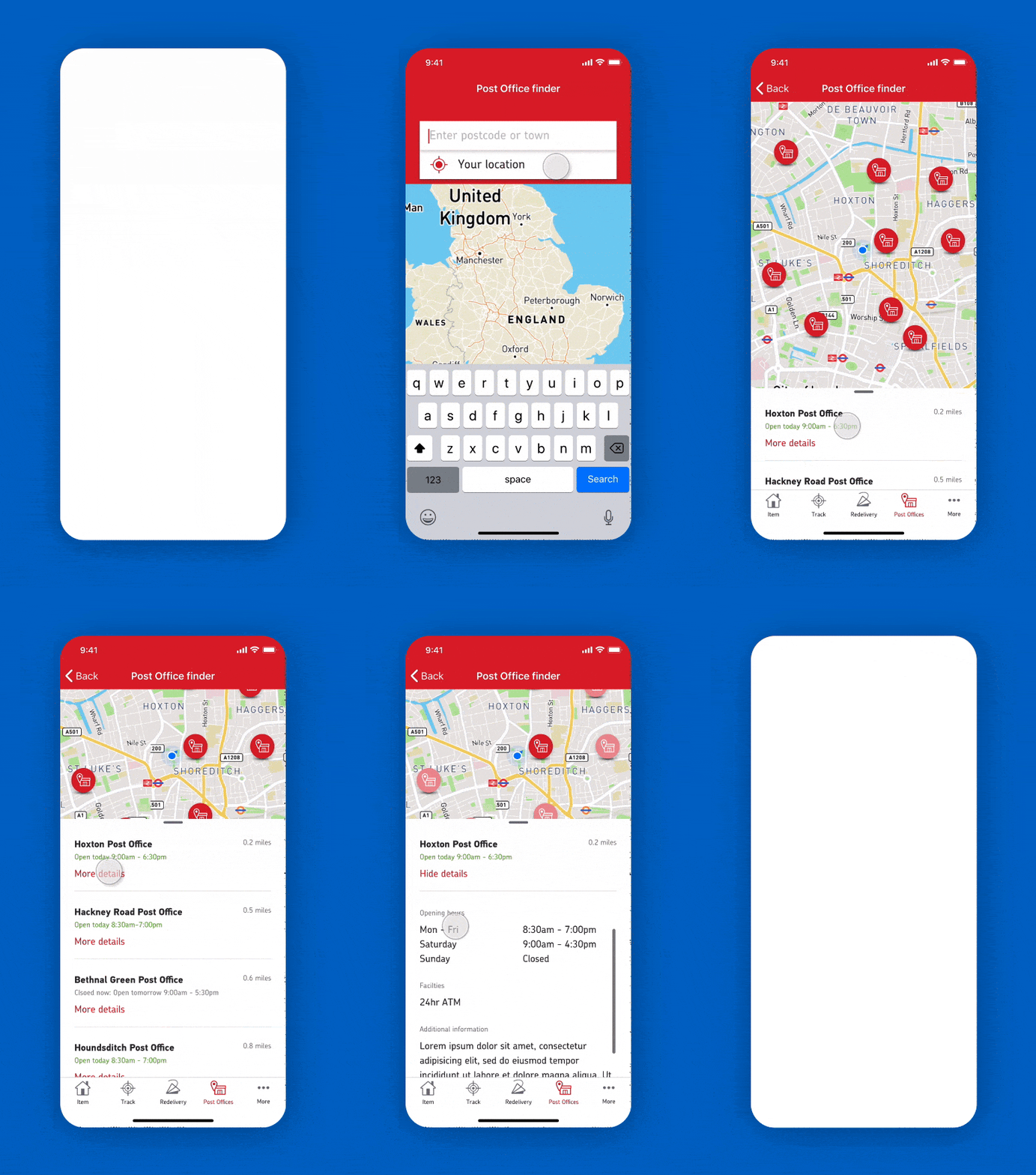
The location based journeys of “Post Office finder” and “Delivery Office finder” are a good example of how component and framework reuse was considered throughout the design process, making for efficient development and helping users by having familiar patterns.
It’s also a good example of how the app has been designed to be proactive with live information (eg. Closed now. Open tomorrow 9:00am - 5:30pm) and consideration to onward journeys the user may need to make. For example, if a user has searched for a Delivery Office, then there’s a good chance that what they’re ultimately looking to do is “Pay a fee” or arrange a “Redelivery”, so options are presented to get them to that next journey.
More Projects
Legal & GeneralProject type
Crowd Connected: ColocatorProject type
iGeolise: TravelTimeMaking sense of travel time
Travel GuardianPutting passengers on the right track
SybenetixUI Design
Copyright © 2018 Mark Hanney
Copyright © 2018 Mark Hanney
Copyright © 2018 Mark Hanney
Copyright © 2018 Mark Hanney